Spotify Cross-Playlist Predictions, Part 2
This is a follow up to the previous post, where the mechanics of making cross-playlist predictions were covered. This post covers the second half of the project: now that we have the analysis method and the important functions worked out in practice, we need to code this functionality into a Shiny app, create a Docker container that holds and runs the app, and deploy the container on Amazon Web Services for public access.
As before, the code is available on Github. It won’t be completely replicated here due to its length.
Shiny
From the earlier work, we already have code for the cross-playlist prediction procedure:
- Downloading the data from Spotify.
- Performing principal components analysis on the songs data.
- Making recommendations from the target playlist.
- Generating the plots of the songs and the principal components breakdown.
So getting this working in Shiny is mostly just a matter of putting the pieces together. Rather than just using raw Shiny, I employed the shinydashboard library to try to keep the structure a bit neater, since we only have a couple of inputs but multiple visuals and other display elements, and the organization of box() and fluidRow() elements makes more sense to me. (It’s also partly because I think basic shinydashboard visuals look nicer than base Shiny, and I didn’t want to get bogged down in the intricacies of laying things out.)
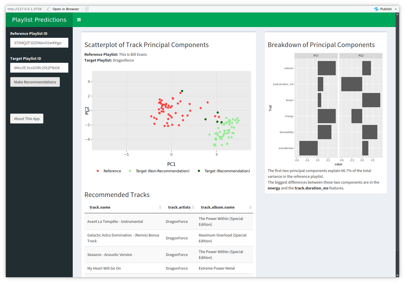
The app ultimately looks like this:

The screenshot was taken with a slightly small window, which is why the fifth recommendation is off the bottom of the screen.
There’s a lot to see here, but since the app is ultimately about the songs and the recommendations, they naturally take up the bulk of the screen. The remainder of the output space goes to visualizing the first two principal components, a dynamic UI element for reporting the variance explained, and another UI element highlighting which parts of the two principal components differ the most. The sole inputs are the two playlist IDs – not the full URLs, since the underlying spotifyr-based code uses the IDs – and a button to make it all happen.
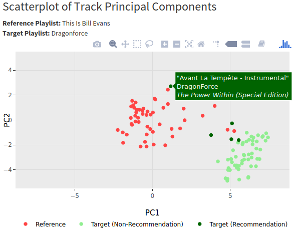
Though it’s not entirely visible from the screenshot, the songs plot is being rendered with Plotly instead of just ggplot. This is mostly just because Plotly gives you tooltips for the data, which I set up to display song title, artist, and album so that additional elements weren’t taking up more screen space.

If you want to use the tooltips like that, just set aes(text=<TEXT COLUMN>) in whichever geom you’re using in ggplot and use the tooltip="text" argument in the call to ggplotly(). There will be a warning about the ‘text’ attribute, as ggplot doesn’t use it but Plotly does, so I had to use suppressWarnings() to keep the app from erroring out on the warning.
Behind the scenes, this is fairly standard Shiny code. The only real “trick” to getting it working was realizing that updating multiple parts of the display required wrapping all of the outputs within the observableEvent() that triggers when the predictions are made. My experience with Shiny so far had been updating a single display element per event, so that’s the main Shiny fact I learned in this project.
> prediction_operation <- observeEvent(input$predict_button, {
>     ## code for getting data and processing it
>     ...
>
>     output$tracks_plot <- renderPlotly({...})
>     output$recommendations <- DT::renderDT(rownames=NULL, options=list(dom="t"), {...})
>     output$explained_variance <- renderUI({...})
>     output$pc_plot <- renderPlot({...})
>     output$reference_playlist_name <- renderUI({...})
>     output$target_playlist_name <- renderUI({...})
>
> }, ignoreInit = TRUE, ignoreNULL = TRUE)
I had hoped to include a decent amount of error checking in the app for things like incorrect playlist inputs or playlists that were too short, but that didn’t work out, unfortunately, so the app just crashes if it encounters an error. In order to avoid that, the playlists must both have at least 5 tracks, and the IDs must go to valid playlists.
Docker
So now that the app itself is together, the next step is to move it into a Docker image. Conveniently, there is a pre-built “shiny-verse” Docker image which has both Shiny and the tidyverse installed on it already, which saves on setup. You just need to make sure you use a sufficiently recent version of R – the app needs the pivot_longer() function in dplyr, which didn’t exist prior to version 1.0, I think, and older Docker images have older versions of dplyr.
The Dockerfile itself is pretty short since all that’s reall done is copy the necessary files, install a few R packages, and start Shiny:
FROM rocker/shiny-verse:3.6.3

MAINTAINER Gregory Janesch "gjanesch@gmail.com"

RUN apt-get -y update
RUN apt-get -y install apt-utils
RUN apt-get -y install libcurl4-openssl-dev
RUN R -e "install.packages(c('plotly', 'shinydashboard', 'shinyBS', 'DT'))"

COPY *.R /root/app/

EXPOSE 3838

CMD ["R", "-e", "shiny::runApp('/root/app/', port = 3838, host = '0.0.0.0')"]
AWS
This is the part that I had the most difficulty with, due to an issue with getting the app viewable. It took some hunting around, but I eventually got the missing piece from this Medium post.
Essentially, I followed the same instructions as in steps 4-6 that post:
- Set up an AWS account and install the AWS command line interface.
- Create a repository in ECR (Elastic Container Registry) for the Docker image, as in step 4. Logging into ECR (at the end of step 4c) is the one issue with that post, as
get-loginis not a valid command in version 2 of the AWS CLI. Instead, I had to useI’m on Ubuntu, so this might be different for Mac or Windows.aws ecr get-login-password --region <REGION> | sudo docker login --username AWS --password-stdin <ACCOUNT NUM>.dkr.ecr.<REGION>.amazonaws.com - Deploy the container using ECS, as in step 5.
- Adjust the security settings to accept traffic on port 3838, as in step 6, since that’s where Shiny is accessed. This was the missing piece – I hadn’t seen any other tutorials discuss this port configuration, even ones talking about the Shiny/Docker/AWS setup I have going here.
Setting it up actually would have been pretty quick had everything been correct – 20 minutes, maybe 30. It didn’t go that fast, but it worked out.
Conclusion
The app is viewable here. If it crashes (indicated by the screen going greyer), just reload the page to get it working. It’s not a particularly fast-executing app, especially since it’s on AWS free tier resources, but it’s functional and it’s viewable, which was the entire goal of the project.
On the whole, I enjoyed this. It was a good exercise in fitting several different technologies together and releasing a practical(ish), interactive product.