Spotify Cross-Playlist Predictions, Part 1
This is the first of probably two posts detailing the construction of an RShiny app. The app in question is meant to take data from two Spotify playlists, make recommendations for tracks from one – which I’ll call the “target” playlist – based on the contents of another – the “reference” playlist. I don’t expect this to be comparable in ability to Spotify’s own system (or anything else, really), but it seems like it should be interesting.
My code is here.
Getting the Data
The first step, obviously, is getting access to the API. It requires making an account and connecting an app to it, after which you will be granted keys to call for OAuth tokens to access the API. The documentation is here. It’s not particularly complicated on its own, but there are two things to note:
- OAuth tokens expire after an hour, so you’ll need to regenerate them over time.
- Calls that get information on tracks are limited to returning information on 100 items at a time, so some pagination is needed for proper access.
As you would expect, someone has written a library – spotifyr – to access Spotify more cleanly. At the time of this writing, however, it’s not on CRAN, with the comments I’ve seen suggesting that it’s due to a break in one of its dependencies. However, since the code for the library itself remains on GitHub, it’s not an issue to just copy the functions we need, which are only dependent on the httr library.
The code for accessing Spotify is largely a straight copy from spotifyr. The main alteration I made was to the get_playlist() function. This function returns information on the playlist itself and some basic information on the tracks. It also handles the issue of pagination so that the user doesn’t have to deal with that. The predictions that the app makes are going to be based on the audio features for the tracks, though, so I had to patch get_track_audio_features() into it.
Features Used & Dimensionality Reduction
Spotify can supply a large amount of data for each track, including track length, tempo, key, and several numeric features that Spotify itself measures. It’s always tempting to just use as many as possible, but under these circumstances, it isn’t necessarily advisable.
Since part of the point of this project is creating a Shiny app, it would be good to have some kind of visualization. This means that I need to get the data down to two dimensions, which means some kind of dimensionality reduction. I decided on doing this with standard principal components analysis as algorithms like t-SNE and UMAP aren’t as easy to interpret. I’m also curious about how the target playlists are represented given the principal components of the reference as a baseline - you can do predictions with PCA after fitting it to one data set, but that’s not possible with t-SNE and UMAP.
PCA has one notable disadvantage for this case. If you have multiple features that don’t vary with each other too much, using just the first two principal components isn’t going to capture much of the overall variation. Consequently, you want to be mindful of how many features you’re using. I’m using six audio features that Spotify has: four which Spotify estimates (acousticness, danceability, energy, and valence), tempo, and the song length.
PCA does seem to preserve the majority of the variance in these variables - I messed around with several playlists for reference, and PCA always seemed to capture at least 50% of the variance. That may not sound like a lot, but some of the experimentation that I did (see below) seemed to give reasonable results, so I think it’s okay. (The final app will use Plotly to display the PCA-transformed song data, so there’ll be some capacity for the user to investigate the songs themselves.)
One other thing to note is that the results are going to be different depending on which order the playlists are in, since the PCA is modeled only on the reference playlist. I don’t think this is an issue though - while the playlists are easy to swap from a programming standpoint, the reference playlist is assumed to be known and liked songs while the target is at least somewhat unknown, so they aren’t conceptually interchangable. Switching the playlists may produce interesting results, but I wouldn’t expect them to be as useful.
Making Predictions
So how to make the actual predictions? Cosine similarity is frequenty used for item-item similarity, but my understanding is that it’s better for high-dimensional predictions (like with word2vec), and this has only two dimensions. What I settled on is based on calculating the Euclidean distances between every track from the reference playlist and every track from the target playlist. The “best” recommendations come from adding together the \(n_r\) shortest distances to reference tracks and then returning the \(n_t\) target tracks with the smallest sums, where \(n_r\) and \(n_t\) are configurable parameters (I just set them both to 5 while experimenting).
Basically, this tries to find songs in the target playlist that are close to multiple songs from the reference playlist. This is in the hope that it will balance out the need for target songs to be close to reference songs and that any target song close to only one reference song doesn’t get picked too easily.
The Overall Process
In short, the sequence of events is:
- Make calls to Spotify to get data on two specific playlists.
- Perform PCA on the reference playlist. (R’s
prcomp()function handles normalizing the values so we don’t have to.) - Plot of the weights of the variables in the principal components.
- Use the calculated PCA model on the target playlist to get how it behaves with those PCs.
- Determine the target songs that are closest to the reference playlist.
- Create a scatterplot of the songs' principal components
Trying it Out
Our first attempt will be with a general “chill” playlist for the reference and a playlist for jazz pianist Bill Evans as the target. The principal components breakdown for the chill playlist mostly distinguishes between acousticness, energy, and tempo:
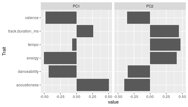
It’s not impressive-looking, but those do account for about 55% of the variance in the chill playlist. On the scatterplot, there’s major overlap between the two playlists, but there is some distinction:
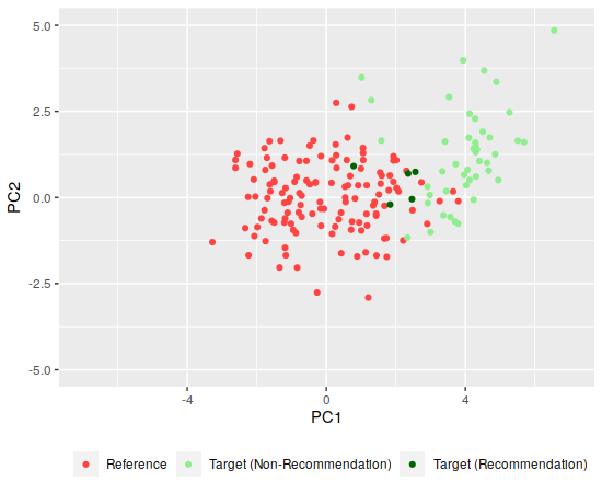
Much of the Bill Evans playlist has more positive values for the first principal component, possibly due to being more acoustic than the chill playlist, which matches up with what my ear tells me about the tracks (the Bill Evans tunes are also instrumental tracks). I won’t try to sort out which are best due to the overlap here.
Let’s try something a bit more different, then - we’ll use the Bill Evans playlist as the reference, but the target is now a playlist of songs from British power metal band DragonForce. The principal components are most different in track duration, energy, and acousticness. (Having listened to a fair amount of Bill Evans, I can confirm that the former two actually do vary a fair amount over his discography.)
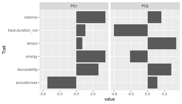
But there’s a pretty distinct separation between the two playlists when plotted:
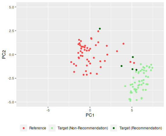
Since the playlists seem more separated along the first component, I’d guess that the DragonForce tracks are all higher valence (which roughly corresponds to positiveness, according to the API docs) and energy (it’s power metal, after all) than the Bill Evans tracks. Among the recommendations, the top-leftmost is “Avant La Tempête,” which is pretty sedate so it doesn’t seem that far off. The other recommendations include the acoustic track “Seasons” and a cover of Celine Dion’s “My Heart Will Go On.”
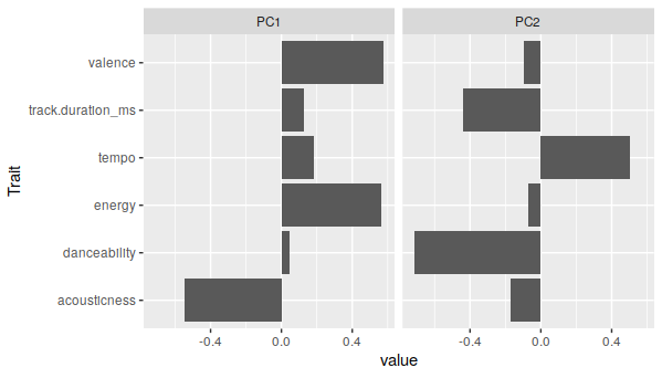
Finally, what I hope is a more intermediate one: a playlist of jazz musician John Coltrane for reference and a playlist of Billy Joel as the target. The two principal compoents are pretty different across most characteristics of the Coltrane playlist:
But the two playlists are actually pretty close together:
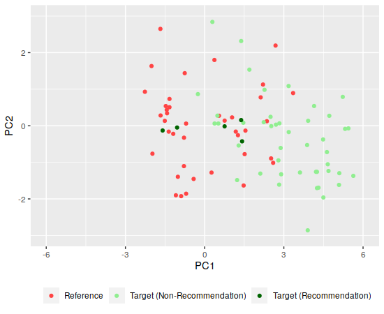
This ended up being less well-separated than I had hoped. Some investigation shows that the recommended songs are some of Billy Joel’s slower ones - “Goodnight Saigon” and “Lullaby” are in there - which is a little unexpected, since I know that Coltrane did a lot of really fast saxaphone solos on his songs, though maybe that’s countered by a combination of the background tempo being lower and the tempo component of both principal components being similar.
Next Steps
We now have all of the code necessary to collect the data, make predictions, and generate plots. So the next step is moving this into a Shiny app and deploying it. This will be handled in a subsequent post.