Partial Regression Plots in Julia, Python, and R
Partial regression plots – also called added variable plots, among other things – are a type of diagnostic plot for multivariate linear regression models. More specifically, they attempt to show the effect of adding a new variable to an existing model by controlling for the effect of the predictors already in use. They’re useful for spotting points with high influence or leverage, as well as seeing the partial correlation between the response and the new predictor.
For a model with predictors \(X_1,…,X_n\) and a response \(Y\), the partial regression plot for an additional predictor \(X_{n+1}\) can be constructed like so:
- Compute the residuals from a model regressing \(Y\) against \(X_1,…,X_n\).
- Compute the residuals from a model regressing \(X_{n+1}\) against \(X_1,…,X_n\).
- Plot the residuals from the first model to the second model.
For this example, I will code up basic examples in Julia, Python, and R. For the data, I’ll use the sat data set from R’s faraway package, which I saved to a file beforehand. This dataset contains records for SAT scores in one year for each U.S. state along with four predictors:
- Expenditures by the school system
expend - Average pupil/teacher ratio
ratio - Estimated average teacher salary
salary - Percentage of eligible students taking the SAT that year
takers
The base model will have SAT scores as a function of ratio, salary, and takers, so we’ll make partial regression plots for expend.
In R
Consider the SAT scores versus expend:
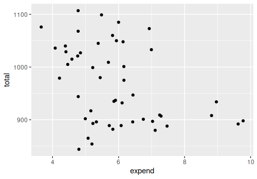
There could be a minor but potentially useful correlation there. However, the partial regression plot looks like this:
library(faraway)
library(ggplot2)

data(sat)
expend_resid <- resid(lm(data=sat, expend ~ ratio + salary + takers))
total_resid <- resid(lm(data=sat, total ~ ratio + salary + takers))
ggplot(data=NULL) + geom_point(aes(x=expend_resid, y=total_resid))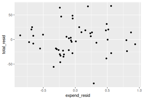
The partial correlation appears to be negligble at best:
cor(expend_resid, total_resid)
## [1] 0.06295197
Presumably because of the very high correlation between expend and salary, which is already in the model:
cor(sat$expend, sat$salary)
## [1] 0.8698015
As for the code, it’s pretty straightforward, since the fact that we can get the residuals directly from the model object makes this very succinct. Technically nothing needs to be imported once the SAT data has been saved to a file, though I strongly prefer using ggplot2 to the base plotting system.
In Python
Python is a bit different in two ways. On the one hand, training data residuals can’t be extracted from the LinearRegression object from scikit-learn, so the code is a bit longer here:
import pandas as pd
from sklearn.linear_model import LinearRegression
import matplotlib.pyplot as plt

sat = pd.read_csv("sat.csv", index_col=0)

expend_regression = LinearRegression().fit(sat[["ratio", "salary", "takers"]], sat["expend"])
total_regression = LinearRegression().fit(sat[["ratio", "salary", "takers"]], sat["total"])

expend_residuals = sat["expend"] - expend_regression.predict(sat[["ratio", "salary", "takers"]])
total_residuals = sat["total"] - total_regression.predict(sat[["ratio", "salary", "takers"]])

plt.scatter(expend_residuals, total_residuals)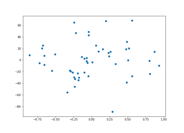
On the other hand, the statsmodels package, which you’ll probably have installed a part of the typical Python data science stack, actually has a function to do that automatically (with default annotations and the regression line between the two sets of residuals, to boot):
import pandas as pd
import statsmodels.api as sm

sat = pd.read_csv("sat.csv", index_col=0)
sm.graphics.plot_partregress("total", "expend", ["ratio", "salary", "takers"], data=sat)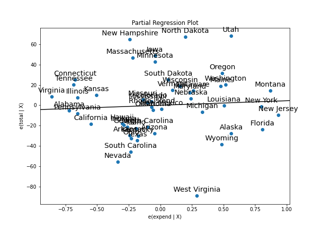
In Julia
Julia is fairly similar to Python in that its GLM package shares the inability to get residuals for the training data from the model object. There are some additional differences in Gadfly’s plotting function, as the default background is transparent.
using CSV
using DataFrames
using Gadfly
using GLM

sat = CSV.File("sat.csv") |> DataFrame
expend_regression = lm(@formula(expend ~ ratio + salary + takers), sat)
total_regression = lm(@formula(total ~ ratio + salary + takers), sat)

expend_residuals = sat["expend"] - predict(expend_regression, sat)
total_residuals = sat["total"] - predict(total_regression, sat)
residual_df = DataFrame(ExpendResiduals=expend_residuals, TotalResiduals=total_residuals)

plot(residual_df, x="ExpendResiduals", y="TotalResiduals", Geom.point, Theme(background_color="white"))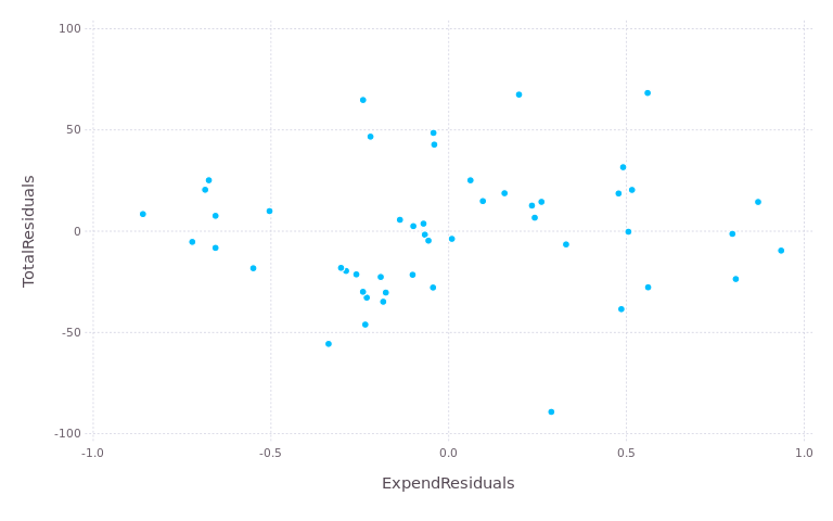
If you’re trying to recreate these plots, note that Gadfly only supports SVG as a file format by default, unlike R and matplotlib. You’ll need the Cairo and Fontconfig libraries if you want to output PNG files.