Markov Transition (Animated) Plots
This is a quick post intended for animating how the transition matrix of a Markov chain changes between larger time steps, as well as showing the probability of the chain being in any specified state over time. This post uses the tidyverse, along with gganimate.
> library(tidyverse)
> library(magrittr)  ## using some aliases not loaded by default
> library(gganimate)
The Transition Matrix
The transition matrix for a Markov chain describes the probabilities of the state moving between any two values; since Markov chains are memoryless, these probabilities hold for all time steps. It is a square matrix like this:
$$ M = \begin{bmatrix} 0.7 & 0.2 & 0.1 \\ 0.2 & 0.5 & 0.3 \\ 0 & 0 & 1 \end{bmatrix} $$
where the row indicates the state you’re starting in and the column indicates where you would end up. Since these are probabilities, and all possible states should be accounted for, each row adds up to 1. Values range from 0 to 1 inclusive; a row with a 1 on the matrix’s diagonal is an absorbing state, meaning that once the Markov chain is in that state, it will never leave it.
A useful property of the transition matrix is that it can represent the long-term probability of ending up in one state given a starting state by just taking a large exponent of the matrix itself. And since it is just a matrix, it’s easy to visualize it with a heatmap, so viewing how those probabilities shift over time is fairly simple.
Similarly, the overall probability of the system being in a state at any given time can be seen over time. If the transition matrix \(M\) converges to a constant value, then if we have a starting probability vector \(s_0\), there should some future point \(t\) where \(s_{t+1} \approx s_t M\) for all steps starting at some step \(t\).
The Functions
One intent of this post is to animate the transition matrix with R’s gganimate library. However, gganimate requires ggplot, which expects the matrices to be in a long format. So a function to transform it appropriately is needed.
> ## Turns a matrix into a three column data frame: row of the cell, column of the
> ## cell, and the value.
> matrix_to_long <- function(m){
>     m_long <- m %>%
>         set_rownames(1:dim(m)[1]) %>% set_colnames(1:dim(m)[2]) %>%
>         as.data.frame() %>%
>         rownames_to_column("Row") %>%
>         pivot_longer(-c(Row), names_to="Column", values_to="P") %>%
>         mutate(Row = as.numeric(Row), Column = as.numeric(Column))
>     return(m_long)
> }
Next, we need functions for calculating the values of the transition matrix and the probability vector at each time step.
> ## s, m, and t are the starting probability vector, transition matrix, and
> ## number of time steps respectively
>
> transition_matrix_over_time <- function(m, t){
>     m_list <- lapply(1:t, function(i){m})    # duplicate the matrix t times
>     m_at_steps <- Reduce(`%*%`, m_list, accumulate = TRUE)
>     m_at_steps <- append(m_at_steps, list(m), 0)
>     return(m_at_steps)
> }
>
> probability_vector_over_time <- function(s, m, t){
>     transition_matrices <- transition_matrix_over_time(m, t)
>     probability_vectors <- lapply(transition_matrices, function(mtrx){s %*% mtrx})
>     probability_vectors <- append(probability_vectors, list(c(s)), 0)
>     return(probability_vectors)
> }
The Reduce function is the key to keeping this relatively compact. It iteratively computes the result of the binary function on the first two arguments, then on that first result and the third element, and so on. Using accumulate=TRUE ensures that every intermediate result is returned from the function, and not just the final result. The append function is used in the latter function to attach the initial probability state and transition matrix so that both sequences can properly start at time step zero.
Finally, we need to return the plots. First, the animated transition matrix plot:
> transition_matrix_animation <- function(m, t){
>     m_over_time <- transition_matrix_over_time(m, t)
>     long_data <- lapply(1:length(m_over_time),
>                         function(x){data.frame(N=x-1, matrix_to_long(m_over_time[[x]]))})
>     long_data <- do.call("rbind", long_data)
>     g <- ggplot(long_data, aes(x=Column, y=Row, fill=P)) + geom_raster() +
>         geom_text(aes(label=round(P, 2))) +
>         scale_y_reverse() + transition_states(N) +
>         ggtitle("Transition matrix at time t={closest_state}")
>     return(g)
> }
Note that the vertical axis is being reversed (using scale_y_reverse()). This is a convenience, so that the first row of the transition matrix is the top row in the plot – since the Row values are both numeric, R would have the matrix upside-down otherwise.
Second, the plot for the states' probabilities. Though doing this as a one-dimensional heatmap was certainly possible, a line chart is probably still more effective for showing change over time.
> state_probability_plot <- function(s, m, t){
>     state_probabilities <- probability_vector_over_time(s, m, t)
>     state_prob_matrix <- do.call("rbind", state_probabilities)
>     state_prob_df <- state_prob_matrix %>% as.data.frame() %>%
>         set_colnames(c("State1", "State2", "State3", "State4")) %>%
>         rownames_to_column("t") %>%
>         mutate(t = as.integer(t)-1) %>%
>         pivot_longer(cols=-c(t), names_to="State")
>     g <- ggplot(state_prob_df) + geom_line(aes(x=t, y=value, color=State)) +
>         ylim(c(0, max(state_prob_df$value)+0.05))
>     return(g)
> }
The only thing I want to note is that we’re fixing the lower limit of the vertical axis to 0 but leaving the upper limit to change with the data – this is just to avoid making it look like whatever has the lowest probability is approaching zero when it may not be.
Example 1 (of 3)
For the first illustration, I’ll start with the following transition matrix:
> m1 <- matrix(c(0.8,  0.1,  0.1,  0,
>                0.05, 0.85, 0,    0.1,
>                0.05, 0,    0.9,  0.05,
>                0.3,  0.2,  0.1,  0.4),
>              byrow=TRUE, nrow=4)
> s1 <- c(0.25, 0.25, 0.25, 0.25)
There are no absorbing states in this matrix, though there are a few impossible transitions. Additionally, the first three states are very likely to stay in the same state if it’s already there, but the fourth state is more likely than not to transition to something else. So ultimately, we wouldn’t expect to be in the fourth state much of the time.
First, the transition matrix:
> g1 <- transition_matrix_animation(m1, 50)
> anim_save("m1_anim.gif", g1, nframes=102)
The transitions stabilize fairly quickly to the same values: roughly 27.8%, 28.9%, 35.5%, and 7.8% for states one through four respectively. As a result, the chances of getting being in each state corresponds to those values:
> state_probability_plot(s1, m1, 50)
It’s somewhat interesting to note that the probability of being in each state isn’t necessarily monotonic: the probability of being in state 4 drops so fast that states 1 and 2 actually experience a spike in probability, both climbing a bit above 30%, before slowly dropping off and stabilizing somewhere below the peak.
Example 2
Let’s move on to considering a chain with one absorbing state.
> m2 <- matrix(c(0.6,  0.29, 0.09, 0.02,
>                0.14, 0.8,  0.05, 0.01,
>                0.08, 0.5,  0.4,  0.02,
>                0,    0,    0,    1),
>              byrow=TRUE, nrow=4)
> s2 <- c(0.25, 0.25, 0.25, 0.25)
Though we do have an absorbing state this time, the probability of one of the other states moving into that state at any given time is fairly small, so we wouldn’t expect the probability of reaching the absorbing state to be very large for a while. Indeed, by the end of the time span we’re looking at, the probability of being in the absorbing state if you start from one of the other states is only about 50-50:
> g2 <- transition_matrix_animation(m2, 50)
> anim_save("m2_anim.gif", g2, nframes=102)
And with an even chance of being in each state at the start, the total chance of being in the absorbing state at the end doesn’t get much above 60%:
state_probability_plot(s2, m2, 50)
But it’s clearly still increasing, and will asymptotically approach 100% in the long run.
Example 3
This time, I’ll have two absorbing states, but we’re guaranteed to start in one of the non-absorbing states.
m3 <- matrix(c(1,    0,    0,    0,
               0.14, 0.8,  0.05, 0.01,
               0.08, 0.5,  0.4,  0.02,
               0,    0,    0,    1),
             byrow=TRUE, nrow=4)
s3 <- c(0, 0.5, 0.5, 0)
Since the non-absorbing states are more likely to transition to an absorbing state in this example than in the previous example, things would be expected to converge quite a bit more quickly. (Especially to the first state, since both non-absorbing states are more likely to go to state 1 as opposed to state 4.)
g3 <- transition_matrix_animation(m3, 50)
anim_save("m3_anim.gif", g3, nframes=102)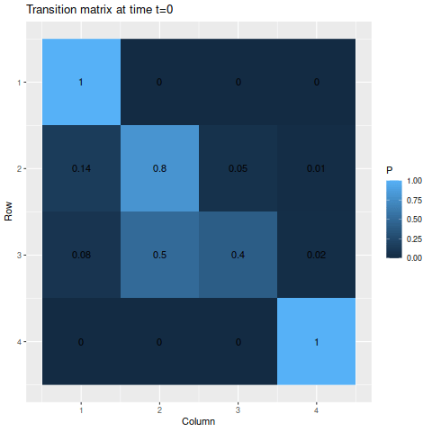
For the absorbing states, the transition probabilities favor moving into state 1 over state 4, so naturally state 1 is the more likely state to be absorbed into. The probabilities of being in each state given the starting probabilities:
state_probability_plot(s3, m3, 50)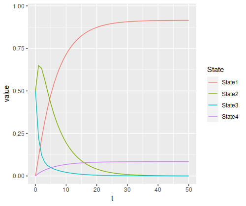
The final probabilities of the absorbing states are about 91.5% for state 1 and 8.4% for state (the nonabsorbing states account for about 0.04%, just enough for a rounding error in the absorbing states). Again, we have a temporary spike in probability of a specific state – since state 3 has a 50% chance of moving to state 2, but state 2 has an 80% chance to remain in state 2, it rises to a 65% chance after the first step before decaying.
There’s one other thing you can see in relationships between the states. Since we’re generally more likely to be in state 2 compared to state 3, the ratio of the final probabilities for state 1 to state 4 looks more like the ratio of their transition probabilities from state 2 than from state 3:
- “State 2 to state 1” versus “state 2 to state 4”: 14
- “State 3 to state 1” versus “state 3 to state 4”: 4
- “Final state 1” versus “final state 4”: about 10.9
I would guess there’s a nice analytical way of proving that, but I don’t know one offhand.