Examination of the K-Means Broken-Line Method
I recently encountered a 2018 paper called “The next-generation \(k\)-means algorithm”. It proposes and compiles advancements and theoretical justifications for \(k\)-means and \(k\)-medians clustering. One part that caught my eye was the proposed “broken-line algorithm” for finding the optimal number of clusters in \(k\)-means. Though it explains how they tested the idea, the paper contains no code and I couldn’t find any other repositories for the paper. This post covers an attempt to replicate the code, as well as attempting a slightly more intensive battery of tests, as there was only one test method in the paper.
The Broken-Line Algorithm
The idea itself is fairly simple – as the paper itself puts it on page 4:
Our broken-line algorithm is an elaboration of the well-known and loosely defined elbow method: (1) Plot the log total within sum of squares, \(S_K\), against \(K\) for a sequence of values \(K = 1, 2, … , K_{max}\), and (2) chose \(K\) at the elbow of the curve, that is, where the line exhibits a change of slope. Although this method is intuitively appealing, there is no formal rule to define the elbow. We facilitate the determination of \(K\) by plotting \(\ln S_K\) and identifying \(K\) where the rate of decrease of \(\ln S_K\) (the slope) changes. Precisely, the broken-line algorithm is as follows: Fit 2 linear regressions using 2 segments of the data, \({S_1, S_2, .., S_K }\) and \({S_{K+1}, S_{K+2}, .., S_{K_{max}} }\), and compute the total residual sum of squares for \(K = 2, 3, … , K_{max}−2\). The optimal \(K\) is where the sum of squares takes a minimum.
So it amounts to a pair of linear regressions on \(\ln(S_K)\) as a function of \(K\), and changing where the two meet to find the minimized sum of squares between the two models. You need to have at least two points in each line, hence the possible values of \(K\) for splitting the results.
Replicating the Paper’s Results
To ensure that my code is working in the first place, I wanted to replicate the results in the paper. According to the paper, their test consisted of the following steps (personal comments are in italics):
- Start with six cluster centers. It’s not clear if the same centers were used every time, though the visualizations below appear to, so I’m assuming that’s the case.
- Generate points for each cluster, according to a multivariate normal distribution with one of four possible standard deviations (0.2, 0.3, 0.4, or 0.5 units). In the paper’s own words, “about 150 points” were used in each cluster in the example visualizations below; I will use exactly 150.
- Fit 24 separate \(K\)-means models for number of clusters \(K=1,…,24\).
- Evaluate the clusterings, using both the broken-line algorithm and 27 other methods in R’s
NbClustpackage to determine the best number of clusters for the data. Only the six best-performing methods – the broken-line and five fromNbClust– are named, so those are the only ones I will use for this initial test. - Repeat the above some number of times. No information on how many times is given.
- Calculate the average of the best number of clusters \(\bar{K}\) for each method and standard deviation, and compare the averages of \(|\bar{K} - 6|\) over standard deviation to determine the overall best method.
The paper has a sample visualization of the data used and its corresponding plot of \(\ln(S_k)\) vs \(K\), which I’m using to estimate the centers of the clusters:
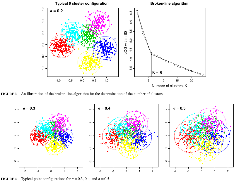
The exact values of the centers are not given, so I’m having to guess at them by blowing up the plot in Figure 3 and estimating the positions based on the pixel locations. From there, we can try to come up with a similar plot to the example in the paper (using a standard deviation of 0.2):
> library(MASS)
> library(NbClust)
> library(tidyverse)
> library(magrittr)
>
> generate_data <- function(centers, n_points, variance){
>     ## Samples multivariate normals around the specified centers using the specified variance.
>     ## Returns a dataframe with the points and the corresponding cluster.
>     generated_list <- lapply(split(centers, seq(nrow(centers))), mvrnorm,
>                             n=n_points, Sigma=variance*diag(dim(centers)[2]))
>     generated_data <- do.call(rbind, generated_list)
>     return(generated_data)
> }
>
> ## Centers for the red, cyan, green, magenta, yellow, and blue clusters in the paper, respectively
> centers_from_paper <- matrix(c(-0.845, -0.048, -0.392, 0.548, 0.276, 0.360,
>                                0.647, 0.899, 0.293, -0.728, 0.935, -0.140),
>                              byrow=TRUE, ncol=2)
> example_data <- generate_data(centers_from_paper, 150, 0.2^2)
> example_data <- data.frame(Cluster=rep(1:6, each=150), example_data)
> ggplot(data=example_data) + geom_point(aes(x=X1, y=X2, color=as.factor(Cluster)), size=2) +
>     scale_colour_manual(values=c("red","cyan","green", "magenta", "yellow", "blue")) +
>     theme(legend.position = "none")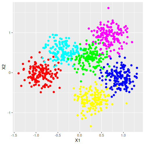
This seems to be a good approximation of the paper’s plot. So next is replicating the full test method and make the table to compare it. The following three functions calculate \(\ln(S_k)\), perform the broken-line method for finding the best number of clusters, and find the best number of clusters with several methods (including the broken-line method), respectively.
> lnSk <- function(x, n_clusters){
>     ## Calculates ln(S_k) of the k-means model with the specified data and number of clusters
>     return(log(kmeans(x, n_clusters)$tot.withinss))
> }
>
> broken_line_method <- function(lnSk_df){
>     ## Determines the best number of clusters using the broken-line method from the paper.  Returns
>     ## the best number of clusters
>     broken_line <- function(lnSk_df, k){
>         first_line_data <- lnSk_df[1:k,]
>         second_line_data <- lnSk_df[(k+1):nrow(lnSk_df),]
>         first_line <- lm(data=first_line_data, lnSk ~ K)
>         second_line <- lm(data=second_line_data, lnSk ~ K)
>         total_rss <- sum(resid(first_line)^2) + sum(resid(second_line)^2)
>         return(total_rss)
>     }
>
>     K <- 2:(nrow(lnSk_df)-2)
>     broken_line_rss <- sapply(K, broken_line, lnSk_df=lnSk_df)
>     best_K <- K[which.min(broken_line_rss)]
>     return(best_K)
> }
>
> best_number_of_clusters <- function(generated_data, nbclust_methods, max_clusters){
>     other_methods_best_K <- sapply(nbclust_methods,
>                                    function(i){NbClust(data=generated_data, method="kmeans",
>                                                        max.nc=max_clusters, index=i)$Best.nc}
>                                    )[1,]
>     lnSk_df <- data.frame(K=1:max_clusters, lnSk=sapply(1:max_clusters, lnSk, x=generated_data))
>     broken_line_best_K <- broken_line_method(lnSk_df)
>     return(c(other_methods_best_K, brokenline=broken_line_best_K))
> }
And to run the simulation (this took about 40 minutes on my machine, so it’s not quick):
> n_runs <- 100
> std_devs <- c(0.2, 0.3, 0.4, 0.5)
> indices <- c("kl", "ch", "silhouette", "ccc", "sdindex")
> max_clusters <- 24
> simulation_results <- sapply(std_devs, function(x){
>     ## note: need to reset random seed each time because NbClust sets seed internally, which jams
>     ## the RNG (and consequently the random data generation)
>     set.seed(NULL)
>     rowMeans(
>         replicate(n_runs, {
>         best_number_of_clusters(generate_data(centers_from_paper, 150, x^2), indices, 24)
>     }))
> })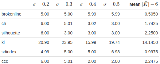
Compare to the table from the paper:
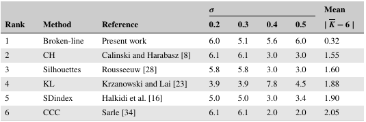
For the broken-line method alone, it’s consistent in being very effective relative to the other methods, though there’s considerable difference between my code’s specific numbers and the ones in the paper. Aside from the sdindex method, the other methods all have higher average absolute errors than the original paper – the kl method in particular is extremely far off – for not obvious reasons. At the very least, NbClust’s code should be the same since the CRAN documentation makes it clear that the code hasn’t been updated since 2015 and the paper of interest was published in 2018, so that shouldn’t be a difference.
A Note on \(\ln(S_k)\)
While debugging the above code, I tried looking at the plots of \(\ln(S_K)\) versus \(K\) to get a better sense of how they were working, and noticed something possibly of interest. At \(\sigma=0.2\), generating random data using the above method produces \(\ln(S_K)\) versus \(K\) plots like the following:
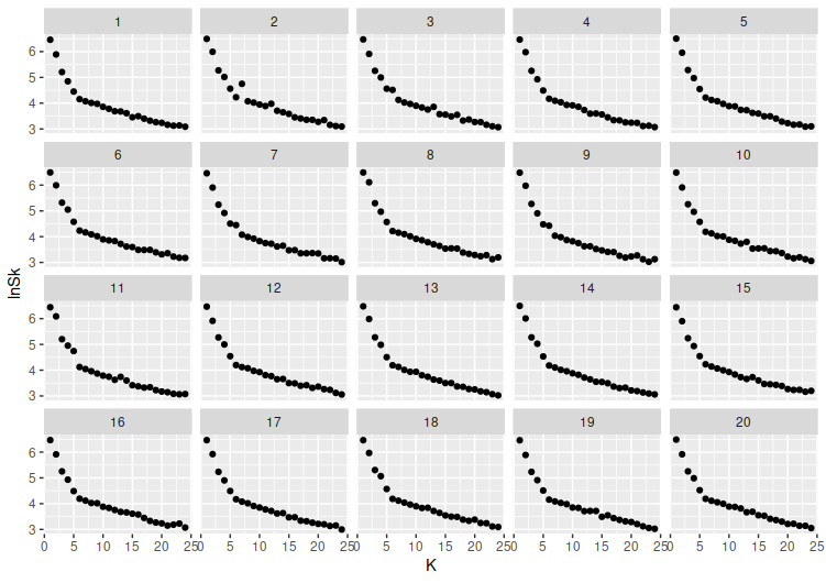
But once that standard deviation drops a bit more, say to \(\sigma=0.05\), things become more irregular:
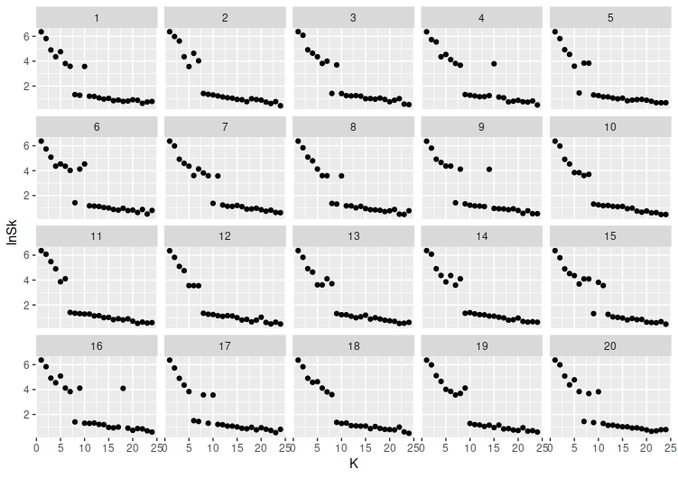
\(\ln(S_K)\) seems to start jumping between a higher level and a lower one. This seems like it might cause the broken-line method to start misjudging the number of clusters, given that the slopes are going to be somewhat out of whack due to the zigzagging between those levels.
Variation: Alternate Broken-Line Sections
The paper contains several plots of \(\ln(S_k)\) vs the number of clusters, all of which have one feature that strikes me: there are two line segments which, if they are supposed to match the broken-line method, don’t. Where the description of the broken-line method uses segments from \(1,…,K\) and \(K+1,…,K_{max}\), the plots in the paper use \(1,…,K\) and \(K,…,K_{max}\), so that both contain the \(K\)th point. Out of curiosity, I tried to simulate this variation.
> broken_line_method_mod <- function(lnSk_df){
>     ## Determines the best number of clusters using the broken-line method from the paper.  Returns
>     ## the best number of clusters
>     ## note: sometimes gives warning "did not converge in 10 iterations"
>     broken_line <- function(lnSk_df, k){
>         first_line_data <- lnSk_df[1:k,]
>         second_line_data <- lnSk_df[(k+1):nrow(lnSk_df),]
>         first_line <- lm(data=first_line_data, lnSk ~ K)
>         second_line <- lm(data=second_line_data, lnSk ~ K)
>         total_rss <- sum(resid(first_line)^2) + sum(resid(second_line)^2)
>         return(total_rss)
>     }
>
>     broken_line2 <- function(lnSk_df, k){
>         first_line_data <- lnSk_df[1:k,]
>         second_line_data <- lnSk_df[k:nrow(lnSk_df),]
>         first_line <- lm(data=first_line_data, lnSk ~ K)
>         second_line <- lm(data=second_line_data, lnSk ~ K)
>         total_rss <- sum(resid(first_line)^2) + sum(resid(second_line)^2)
>         return(total_rss)
>     }
>
>     K <- 2:(nrow(lnSk_df)-2)
>     broken_line_rss <- sapply(K, broken_line, lnSk_df=lnSk_df)
>     best_K <- K[which.min(broken_line_rss)]
>     broken_line_mod_rss <- sapply(K, broken_line2, lnSk_df=lnSk_df)
>     best_K_mod <- K[which.min(broken_line_mod_rss)]
>     return(c(brokenline=best_K, brokenline_mod=best_K_mod))
> }
>
> best_number_of_clusters <- function(generated_data, nbclust_methods, max_clusters){
>     other_methods_best_K <- sapply(nbclust_methods,
>                                    function(i){NbClust(data=generated_data, method="kmeans",
>                                                        max.nc=max_clusters, index=i)$Best.nc}
>     )[1,]
>     lnSk_df <- data.frame(K=1:max_clusters, lnSk=sapply(1:max_clusters, lnSk, x=generated_data))
>     broken_line_best_K <- broken_line_method_mod(lnSk_df)
>     return(c(other_methods_best_K, broken_line_best_K))
> }
>
> n_runs <- 100
> simulation_results <- sapply(std_devs, function(x){
>     set.seed(NULL)
>     rowMeans(
>         replicate(n_runs, {
>         best_number_of_clusters(generate_data(centers_from_paper, 150, x^2), indices, 24)
>     }))
> })
This is a pretty mild improvement, maybe enough that it’s not that useful. Still, I think it’s interesting enough that I’ll use it in the remaining comparisons.
Additional Testing: Number of Clusters
One of the things I wanted to test was whether changing the number of clusters would strongly affect the performance. I tried generating cluster centers from uniform distributions on 0 to 1, but with a condition on the minimum distance between clusters. The shortest Euclidean distance between two of the cluster centers that I derived from the paper was about 0.654 units; this simulation maintains a minimum distance of 0.45 units between all cluster centers, as increasing it much higher would make the cluster center generation extremely slow once you get to 10 or so clusters.
> pairwise_euclidean_distances <- function(point_matrix){
>     ## returns vector of all possible Euclidean distances between a matrix of points
>     combn(nrow(point_matrix), 2, function(x){sqrt(sum((point_matrix[x[1],]-point_matrix[x[2],])^2))})
> }
>
> n_runs <- 50
> num_cluster_simulation <- sapply(2:10, function(x){
>     set.seed(NULL)
>     rowMeans(
>         replicate(n_runs, {
>             min_dist <- 0
>             while(min_dist<0.45){
>                 cluster_centers <- sapply(1:2, function(y){runif(x, min=-1, max=1)})
>                 min_dist <- min(pairwise_euclidean_distances(cluster_centers))
>             }
>             best_number_of_clusters(generate_data(cluster_centers, 150, 0.2^2), indices, 24)
>         }))
> })
The results:
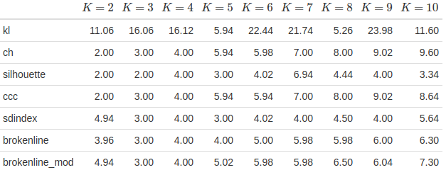
The ch and ccc methods both perform very well, managing to usually be pretty close to the true number of clusters. The broken-line methods, in contrast, don’t do that well – they’ve tended to overestimate the number of clusters in the \(K=2\) case, and they both consistently underestimate from about \(K=7\) onwards. They’re good in the range of 3 to 6 clusters, which is consistent with what was seen in the paper, but extending it much farther seems to throw it off. The modified method performed or not worse overall aside from the \(K=2\) case. And I still don’t really get why the kl method is so far off.
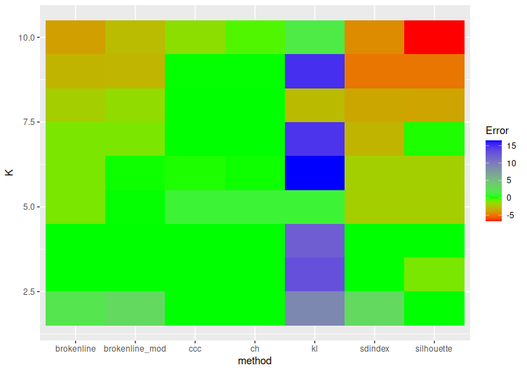
To try and help visualize this, consider the below graph. The coloring is set so that green is at zero error (where the average number of clusters predicted equals the actual number of clusters), redder colors are average underpredictions, and bluer ones are average overpredictions.
Additional Testing: Number of Points
Another idea was to see if there was any difference based on the number of points. This experiment basically just took the recreation of the paper’s simulations – six clusters with static centers, generate random data for each test – but fixed the standard deviation at \(\sigma=0.2\) while changing the number of points in each cluster. The results:
> n_runs <- 50
> n_points <- c(20, 50, 150, 400)
> num_points_simulation <- sapply(n_points, function(x){
>     print(x)
>     set.seed(NULL)
>     rowMeans(
>         replicate(n_runs, {
>             print(Sys.time())
>             best_number_of_clusters(generate_data(centers_from_paper, x, 0.2^2), indices, 24)
>         }))
> })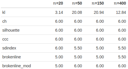
There’s some sense that the broken-line method might work better with larger numbers of points in this scenario, but the method doesn’t seem much worse with fewer data.
Additional Testing: Maximum Number of Clusters
Since the maximum number of clusters is another variable in the model, I decided to check whether it had an effect on the model. Again, this was collected using the method duplicated from the paper, but with fixed standard deviations and only changing the maximum number of clusters.
> max_clusters <- c(10,12,14,16,18,20,22,24)
> n_runs <- 50
> max_clusters_simulation <- sapply(max_clusters, function(x){
>     print(x)
>     set.seed(NULL)
>     rowMeans(
>         replicate(n_runs, {
>             print(Sys.time())
>             best_number_of_clusters(generate_data(centers_from_paper, 150, 0.2^2), indices, x)
>         }))
> })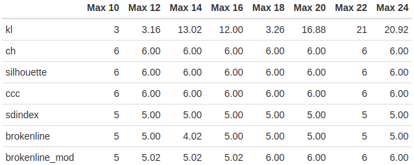
It looks like a higher maximum number of clusters might help the modified broken-line method, but it doesn’t seem to help the original much. I’m also not sure why the original suddenly dropped to 4 clusters at the 14-cluster maximum case.
Conclusion
While it’s conceptually interesting, I’m not sure how effective the broken-line method is overall compared to existing methods. In the case presented in the paper, the broken-line method seemed to do much better than the other methods, both in the paper’s results and my own testing. Trying to go much beyond that, however, suggests that the paper’s analysis presented somewhat idealized circumstances for the broken-line method, as it wasn’t generally the best method in any of the extended testing.
Of course, the biggest question mark in all this is how well my code matches the unknown code of the original paper. The results I had from trying to duplicate the paper’s analysis differed a lot in the specifics of the various methods' scores. Without knowing why, the full analysis here should be taken with a grain of salt.
Finally, the simple fact that a moderately intensive search for the broken-line method turns up no results may be the biggest indicator of all – I certainly hadn’t heard of it until I stumbled across the paper by chance, so it may have been shot down by others already.